Build credibility from nothing.
Due that day, the identity had to feel established, scale across applications, and support compliance content.
Rapid brand identity · 2022
A bank identity for a capstone case study, completed in a few hours.
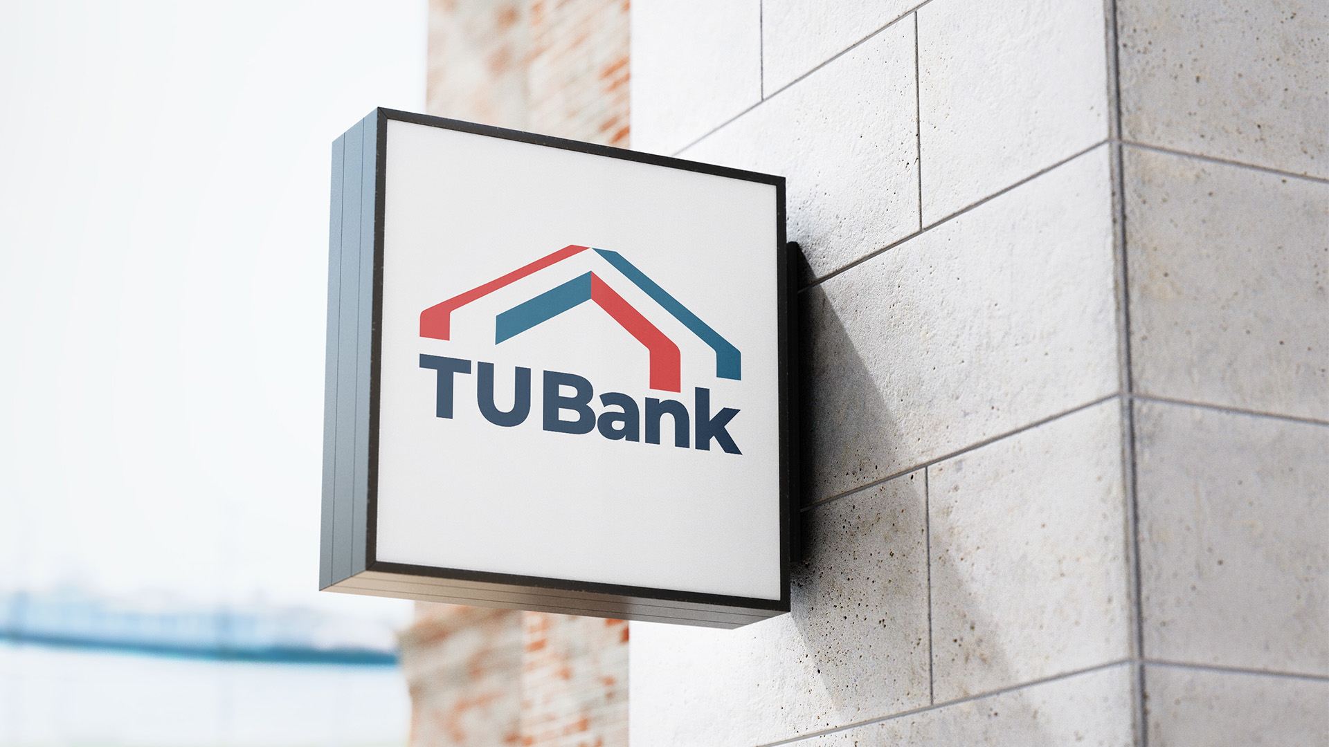
Due that day, the identity had to feel established, scale across applications, and support compliance content.
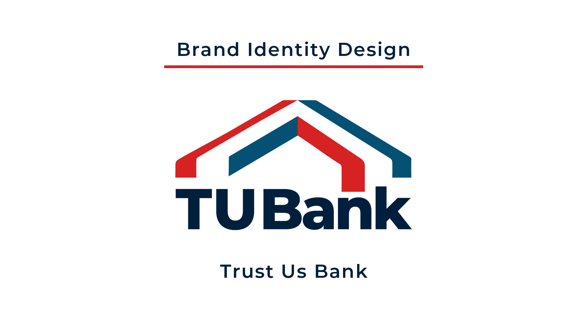
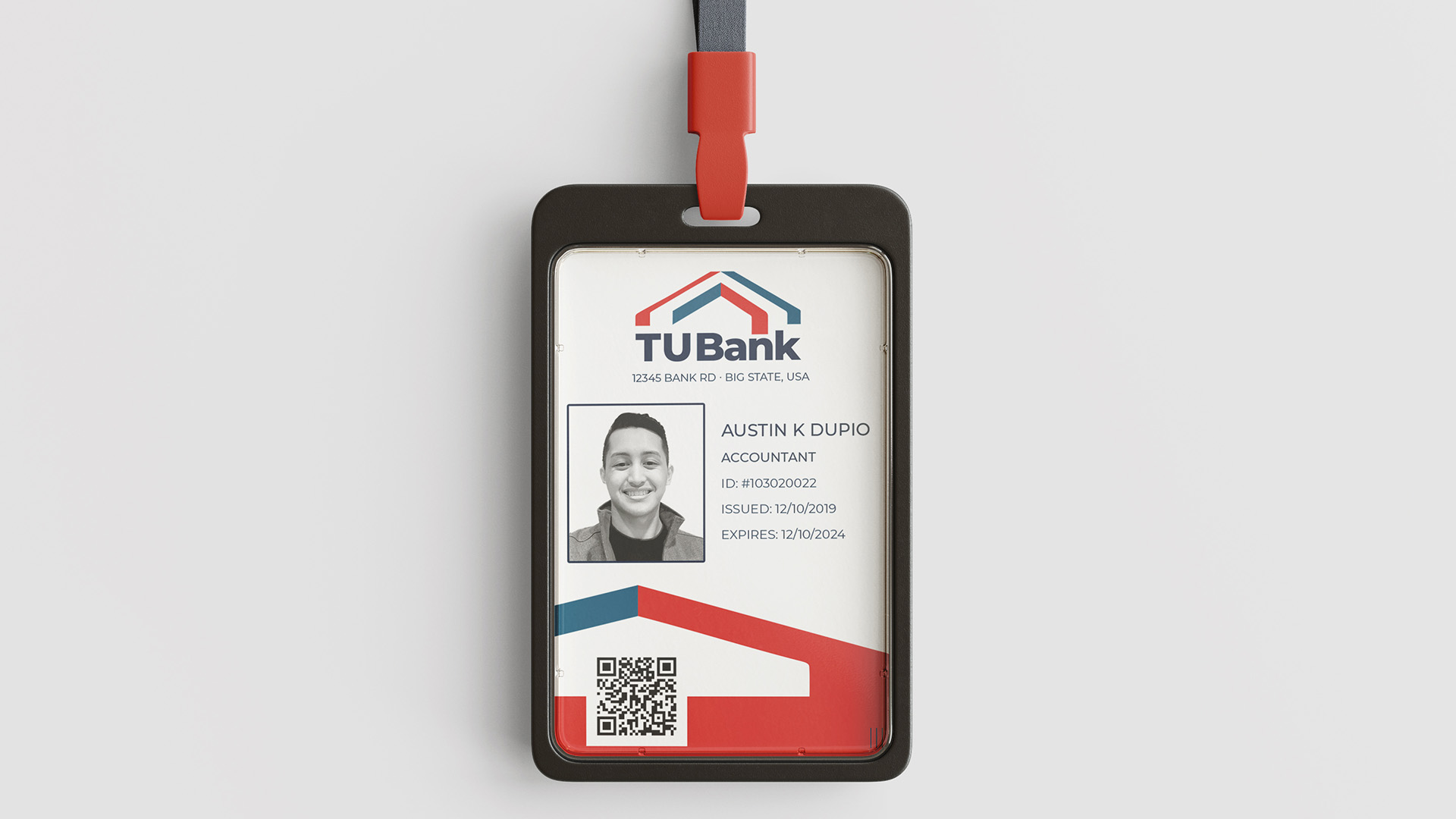
I defined the logo, palette, typography, spacing, and applications, then prepared final assets for the team's presentation.
The team presented to bank executives and federal regulators and reported high marks for the project's professional visual presentation.
My role: I created the Trust Us Bank identity and publication-ready brand assets. The participating team developed the compliance program and recommendations.
Identity system
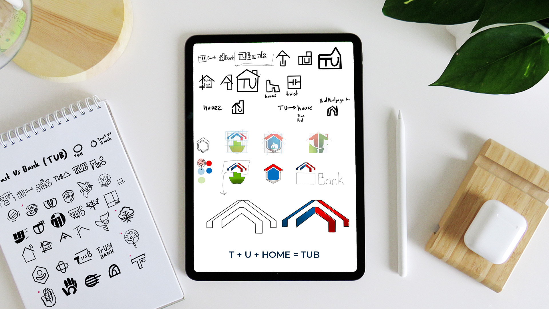
A focused concept moved quickly from sketch to a repeatable financial-services identity.
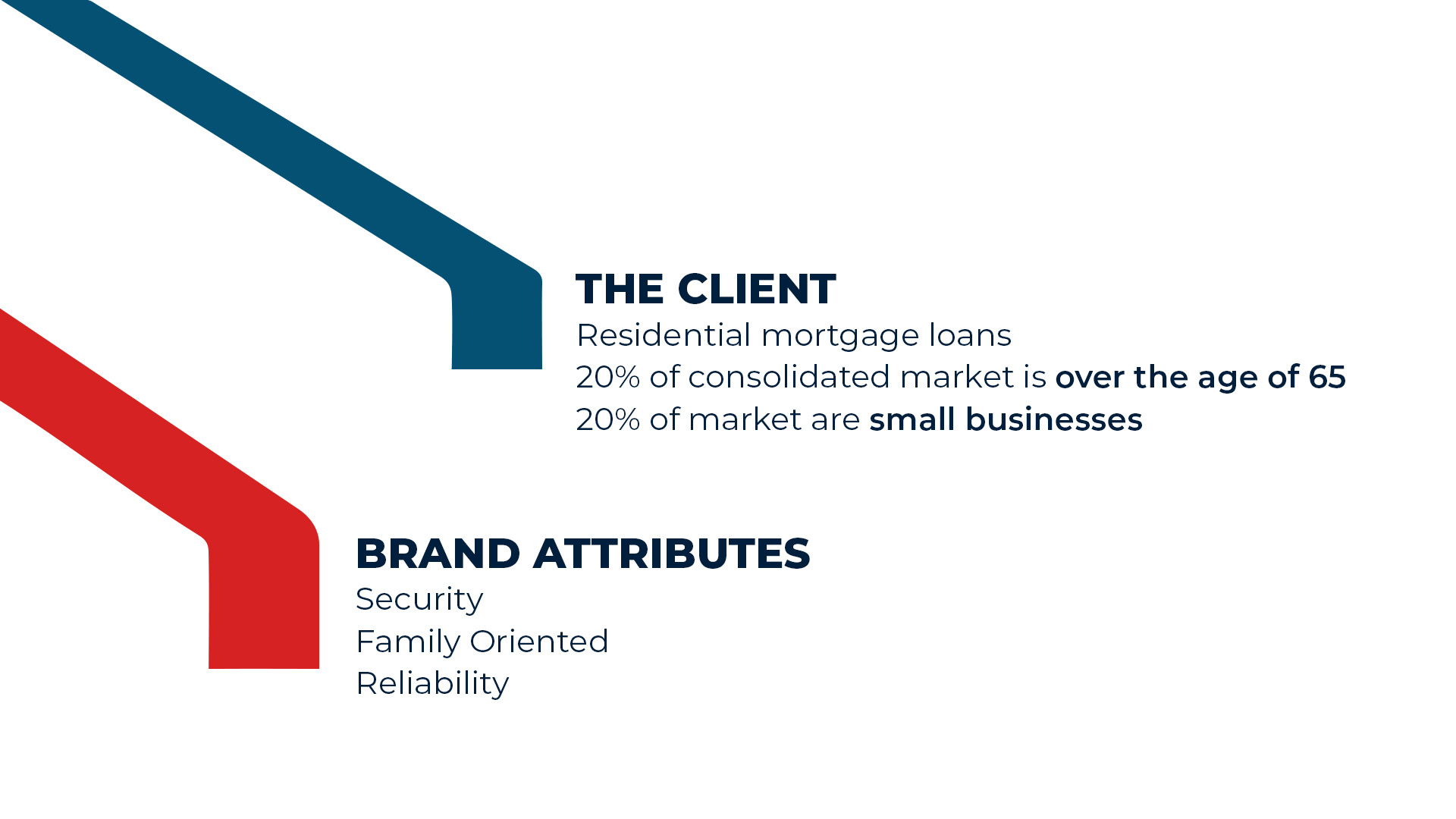
Design decisions
The short timeline made hierarchy and system thinking essential.
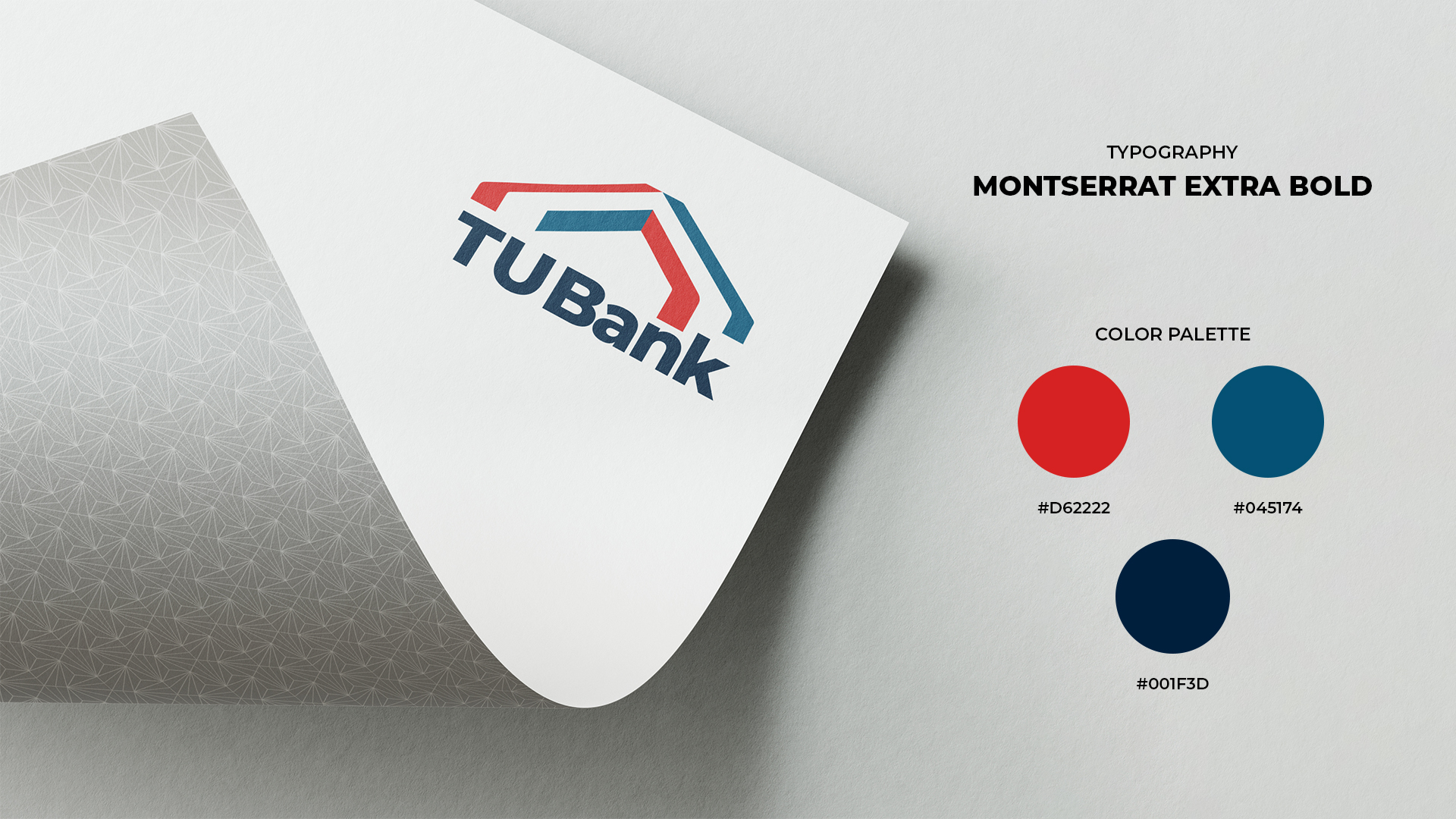
A geometric mark and disciplined red, blue, and navy palette signal stability and trust.
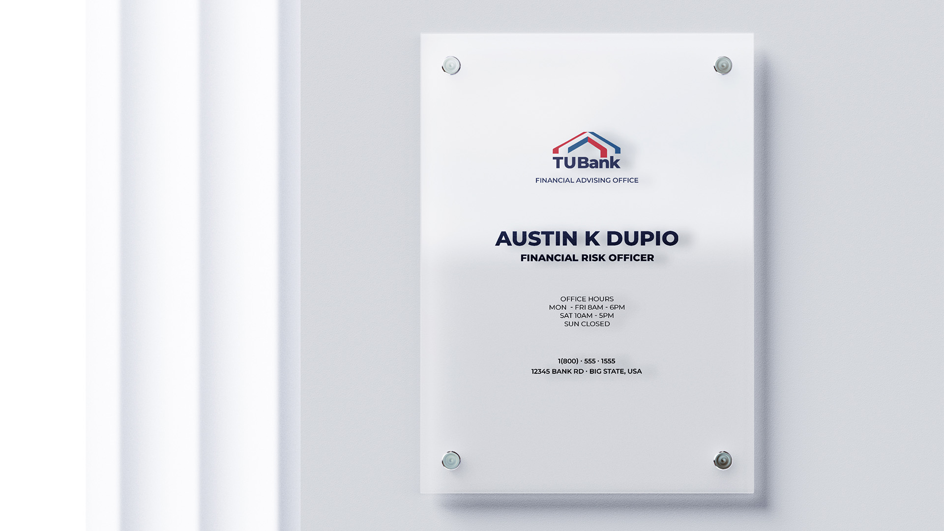
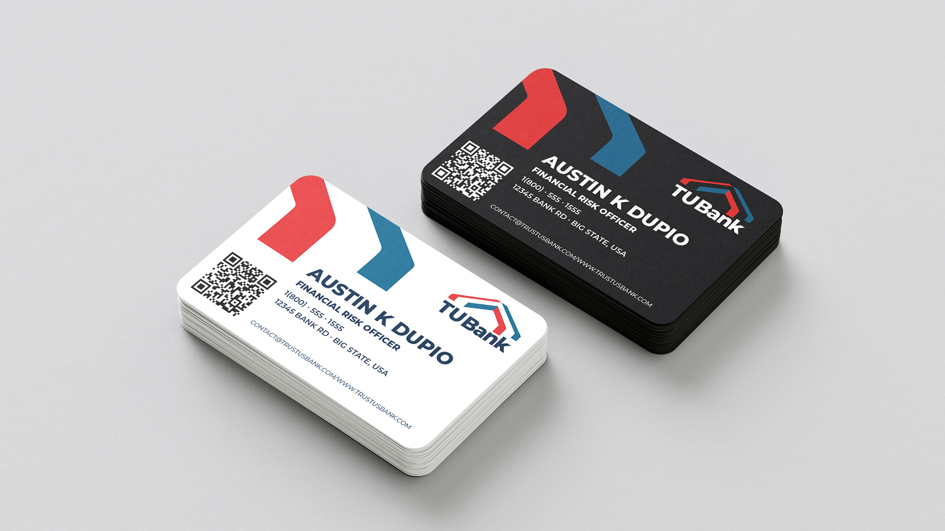
Consistent type, color, spacing, and logo use keep every application connected.
A focused exploration and quick selection left time to carry the strongest direction through production.
Brand applications
Recognition
“…and to Austin Dupio for our case study bank branding!”
Reflection
I focused on the logo, type, and color first, then prepared the applications for the same-day presentation.